Logos that lack relief
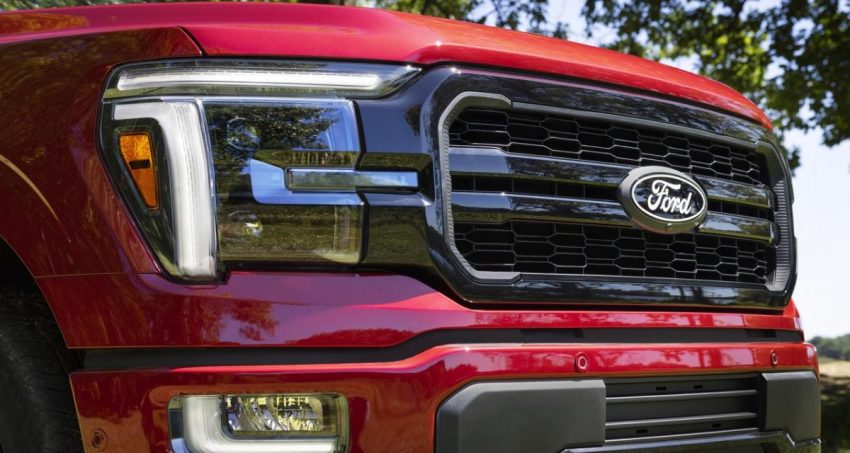
There has been a clear trend in automotive logos in recent years. One by one, most major car manufacturers have abandoned the gradients and 3D touches added in previous decades in favor of simpler and flatter designs, the famous “flat design”, which we continue to deplore in our columns. . How sad. Purism taken to its peak, introduced among other things by high-tech design, has taken over many interiors, to the point that it is sometimes difficult to characterize and distinguish them. This Ford logo, based on cursive writing, was one of the last to hold out, but it appears it has finally given way. On the occasion of the restyling of the F-150, the pickup took the opportunity to discreetly display a new Ford badge. But without announcement of the change, one may not notice it at all.
Simpler, while keeping the oval
The design abandons the chrome appearance from the previous logo and slightly enlarged the size of the “Ford” script with simple white accents, removing the thin silver oval outline that was inside the badge. If this looks familiar, that’s because it’s very similar to the classic design used in the 1960s.
The new badge retains the classic stylized Ford script that has been used in various forms since it was developed by the company’s first chief engineer, Childe Harold Wills, in 1909. It is good news that the blue is nevertheless preserved, even if it appears darker and with less relief. The chrome finish and outer border were replaced with simple white, and the inner border was removed. The blue also gives way to a darker shade, which tends towards black. This is radical, but it remains to be seen whether this will be limited to special finishes, like the F-150 which has a Black finish pack.
Now that the change is known, we can bet that it will be installed on future models and that Ford will communicate more.


